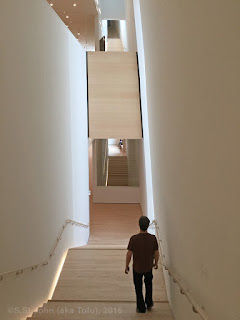
The long wait is over and the new, expanded San Francisco Museum of Modern Art is
back. And, in keeping with the word of
2016, the museum is HUGE! With the addition added to the existing
building, the museum is about three times as big as it was before – making it
one of the largest art museums in the country.
Yesterday I was able to get a preview visit before the grand opening on
May 14th.
First, let’s talk architecture – last week the Guardian
ran a hit piece that was hilarious and whiny in that way only the English can
complain. As amusing as it was, I
suspect the reviewer might have only looked at the architectural renderings. The new building is great – sure one could go
through and nitpick with any new building, but overall it is really good. The museum is spacious, natural light is
allowed in and there are additional and welcome terraces where visitors can get
some fresh air when they need to take a break.
Fortunately, the Tuesday afternoon preview was not crowded, but even on
busy days, the space seems well prepared for crowds to flow through.
It’s the spaciousness that is the key. A major shortcoming with the old museum was its
lack of what I call “vista walls.”
Large, modern pieces need those rooms and galleries where visitors have
a nice long approach to the big work.
The new museum has no shortage of clean, open rooms. And, with plenty of space, many artists are
given their own gallery. There are few modern
art museums that can dedicate so many rooms to individual artists.
The SFMOMA retains its “top-down” plan where the logical
approach is to ride the elevator to the top floor (7) and work one’s way down
via the stairs. The museum is so large
now, that it has reached the size of “too big to see in one visit.” Again, the terraces to pause for a rest are
welcome along with the extra café areas.
I never see the need for multiple museum gift shops, but I do enjoy
having a break and a coffee in the middle of a museum trip.
As you work your down the stairs you find a remodeled third floor
focusing on photography. It’s always
been a strong point of the SFMOMA’s collection and the third floor could be a
museum in itself. The second floor
becomes familiar as the galleries retain the feel of the older building and
include the original collection. And for
all the new, the second speaks mostly to my personal taste — I like the second
floor best of all.
As the museum has grown with the addition of the Fisher
Collection and plenty of other newly acquired works, what is missing in the
massive institution becomes painfully obvious.
There is that persistent, disappointing under-representation of
California artists. Sadly, the SFMOMA
remains reluctant to showcase what all Californians should be proud of – our
art. This is why I steer out-of-town
visitors towards the Oakland Museum or on to
the Crocker in Sacramento and
the di Rosa Preserve up in Napa. While the collection of German modern art is
excellent at the SFMOMA, if you have come all the way from Hamburg or Berlin,
is that the art you want to see in California?
And of course, unsurprisingly, works by women and artists of
color still can be a challenge to find.
One could make a sad scavenger hunt seeking out diversity. This is a job for the Guerilla Girls!
The new SFMOMA is a forward-looking building and a great
start, but it now needs to grow into the 21st Century and represent
a broader cross-section of modern art and artists.


nice post
ReplyDelete