Cutting up old postcards and making some ATCs.
Showing posts with label Artist Trading Card. Show all posts
Saturday, June 5, 2021
Thursday, November 15, 2018
Tile-Inspired ATCs
I love mosaics and ceramic tile. San Francisco has plenty of wonderful examples of tiled public art (including right around the block from my home). That said, I needed to come down to Mexico to be inspired for a new series of ATCs painted on playing cards. I suppose it took escape-vacation mode to make these happen. More soon….
Labels:
Art,
Artist Trading Card,
ATC,
Mexico,
mosaic,
painting,
puerto vallarta
Wednesday, October 17, 2018
Wednesday, November 8, 2017
Fall Colors
As I was sorting through and organizing some of the recent
mail art I received, I noticed I had quite a colorful pile on my desk. Here are some of the recent arrivals:
- A very tactile ghostly greeting arrived from Maureen Forys.
- Barbara Stasiowski sent a Halloween-themed collage.
- A colorful lizard (or maybe a gecko) arrived from Susan Stewart in Florida.
- Marina Salmaso’s latest piece is my favorite from her to date. Simply collaging with the insides of envelopes – the results are like a patchwork landscape.
- Gregg Biggs sent a Pink Person.
- Deb Faulnker’s collage postcard is dreaming of chocolate milk.
- Dori Singh’s Halloween-themed mail is like a ghostly Victorian letter.
- A new set of ATCs from Fleur Helsingor that even incorporates some of the Mexican play money I sent to her.
- The latest update from Connie Jean’s Squirrel Museum came in from Florida.
- Reminding us that Halloween becomes more and more of an international holiday, Katerina Nikoltsou sent Halloween greetings from Greece.
- A more serious piece about wartime atrocities from Valdor in Catalonia.
- An envelope from Ed Giecek is always a work of art.
- Brooke Cook’s’ colorful piece celebrates both Halloween and Friday the 13th.
Labels:
Art,
Artist Trading Card,
ATC,
Mail art,
Mixed Media,
postal,
postcard,
snail mail
Saturday, July 15, 2017
time + color + memory
Memory is a funny
thing — when hearing a piece of music or getting the whiff of a smell can
instantly transport you to back to another time and place in your life. We have all experienced it – and as we get
older, the opportunities for these moments of sensory recall increase. What about color? Can a certain color, or more precisely a
shade of a certain color, take you back?
It happens to me – these moments of color recall. When I see a 1970s blue – you know, that true
blue that is not so common today. I never drove black or silver cars. My vehicles were shades of orange and even
purple. The modern architecture we now
call brutalist is the cold gray of formed concrete associated with my formal
education. Whenever I see that sad
salmon color, I think of subway stations in Stockholm or wallpaper in
Poland. I landed in San Francisco in
1990 – a city full of cafés with sponge painted walls (I confess even my
kitchen succumbed to the trend for a few years). My local café never repainted for over 20
years. Bean There’s walls felt historic,
though sadly the café was recently brought to end by a greedy landlord. The nightclub black, was it what we wore or
the matte black paint that covered every surface back then? And when you end up working for an interior
designer you learn they only have one color in the box. At least it wasn’t beige or taupe — I worked
in a world of tasteful brown — just lots and lots of brown.
This week I have
expressed those colors in a new series of ATCs that also, unintentionally, are
a little color autobiography. They are
now off in the mail.
Labels:
Art,
Artist Trading Card,
artistic process,
ATC,
color theory,
Mail art,
Mixed Media,
postal,
San Francisco
Thursday, June 1, 2017
ATCs of Palette and Place
Yesterday’s outgoing mail included my latest series
ATCs. In this series, the Collagescape idea that I began with in 2014 takes
another direction. There are eight
different designs in the series. Each
design shows different place that has been reduced to four individual
colors. The colors are used to represent
a certain place and, in some cases, a time of the year.
Thursday, April 13, 2017
ATCs in the Mail
The best part of sending out Artist Trading Cards is the trading.
And after sending our a round of National Park-themed ATCs recently, I
am started to receive more in return.
This first batch includes ones from:
And now it is time to get back to the new series I am
working on, stay tuned…..
Saturday, March 4, 2017
Take a Hike! — National Park ATCs
There is a great
deal of expectation for artists to respond to the lunatic and his cronies that
have occupied our White House. As an
artist I feel compelled to respond and yet I am torn. I rather not let such negative energy into my
art space. I want to make pleasant art and let my head escape to the national
parks I love. It is remarkable that
something as innocuous as National Park-themed ATC’s could be perceived as something
political. But these are remarkable times when our federal lands, lands
protected for future generations, are under siege. Even the voices of park rangers are being
censored. Today’s outgoing mail art includes artist trading cards with the
“radical” notion that the land administered by the National Park Service is to
be loved and protected.
Labels:
arches,
Art,
Artist Trading Card,
ATC,
California,
Cape Cod,
desert,
National Park,
not my president,
painting,
Point Reyes,
wupatki,
yellowstone
Monday, May 16, 2011
5th Annual Artist Trading Card Exhibition – Part II

Earlier this year I participated in an Artist Trading Cards (ATCs) up at the Richmond Gallery up in British Columbia (see previous blog entry).
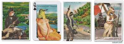
One of the rewards is that my cards were traded and sent on to other artists. I received some cards in return from the gallery and am quite pleased with that arrived in my mailbox. A few of the new pieces are seen above. The include a piece from Ian Addison Hall’s series progress as seen through a hole, a simple and beautiful little water color from Preetika Rajgariah, and a collage from Monique Motut-Firth.
Subscribe to:
Posts (Atom)